In the five months since we launched the Draft U.S. Web Design Standards — the U.S. government’s very own set of common UI components and visual styles for websites — over a dozen websites have used components of the Draft Standards on their sites.
Recently, we talked to three federal web designers about their experiences using the Draft Standards, which were designed with accessibility and flexibility in mind:
- Maria Marrero is the User Experience Designer for USA.gov.
- Luke Keller is a Presidential Innovation Fellow and product designer who worked on vote.usa.gov.
- Eddie Hunter works on the U.S. Geological Survey’s HazDev web team, which is working on a web application for displaying earthquakes as well as a website for the Earthquake Hazards program.
Each site incorporates parts of the Draft Standards in different ways. We chatted with Maria, Eddie, and Luke about their experiences using the Draft Standards — and how they would improve them.
1. How did you hear about the Draft Standards and how did you integrate them into your sites?
Maria Marrero: I first heard about the Draft Standards when this effort was just an initial idea by the U.S. Digital Service and 18F teams. As a User Experience Designer for USA.gov, another platform managed by the General Services Administration, I found it incredibly useful and something that is needed across government websites. The USAGov team then started connecting with the core team of developers and designers to get this effort kicked off.

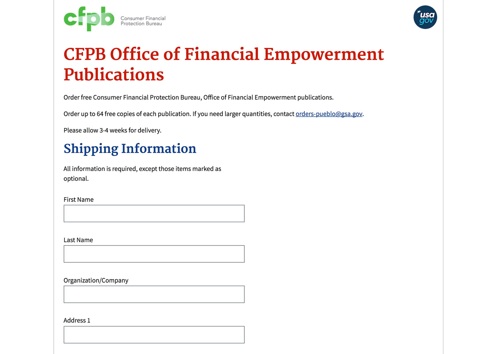
USA.gov has adopted the Draft Standards with some of the forms that are used by our users and agency partners to order government publications.
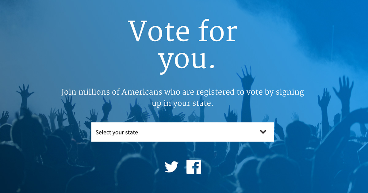
Luke Keller: The Presidential Innovation Fellows (PIFs) heard about the Standards through our colleagues at 18F and USDS before they had launched. Given our tight deadline for launching vote.usa.gov (two weeks), we literally could not wait for their release so we rolled out a custom Bourbon installation and integrated components of the Draft Standards manually.
Eddie Hunter: The Web Design Standards project was brought to the attention of the team by our boss who had spotted the effort on Twitter. We had been iterating our own template with similar design elements and decided to start incorporating the 18F Draft Standards into what we were developing.
2. What components did you use?
MM: So far, we have incorporated form templates on a few of our promotional pages where users can order government publications online. We are currently mapping components from the USAGov platform with the ones included into the draft release of the Standards and will continue to incorporate them in the future.
LK: Our team was very excited about the branding and dropdown components featured in the Standards. Because of the short runway to bring vote.usa.gov from concept to launch, we used the Standards’ brand components to remove the guesswork from the design process and expedite our launch. Without these components, I’m certain we would have launched a much less attractive and user-friendly vote.usa.gov.
EH: We started by highlighting the visual aspects that we liked in the 18F design.
We were looking to improve readability on some of our documentation pages. We felt that the serifed Merriweather font headers worked nicely to provide a visual break when the body text was styled with Source Sans Pro.
The 18F form controls provide a flatter and easier-to-read alternative to our previous controls. The bold red error reporting styles/text work well for grabbing the user’s attention while validating their inputs. We like the alert styles, however we made small changes by replacing the icons used in the alert boxes with icons from Google’s Material Icon Font.
We theme our different websites in order to inform users about which site they are currently on. We used Sass variables to organize the design elements and style our pages with site specific colors. We adopted the 18F variables that configure primary and secondary colors. This helped us simplify our Sass markup by reducing the number of variables we use.
3. Do you have any advice for other federal web administrators who might want to adapt the Draft Standards?
MM: As the Draft Standards continue to reach a more mature level, I would say that planning to implement components that are simple and easy to integrate first is the best approach. The USAGov team decided to adopt some of the Standards in incremental phases and based on their level of complexity. That way, if there are any updates, the effort to get the latest version would be minimal.
LK: I’d recommend familiarizing yourself with thoughtbot’s Bourbon gem. The Design Standards are built on top of this highly adaptable gem, so knowing how to use and extend it’s default functionality will help you utilize the full functionality of the Standards and what’s underneath.
EH: Although we chose an iterative approach towards adopting these design standards I would advocate for a more wholesale adoption of the style guidelines/template. With full integration into the the 18F Web Design Standards you become a more engaged participant in the improvement and debugging of the current standards.
4. What could 18F do to improve the standards?
MM: This effort is an evolving product where updates are constantly being made, so I think that improving a public maintenance and communication plan would be helpful for agencies or projects that have already implemented the Standards and are in need of updated code.
LK: I’d like to see the Standards utilize the power of antialiasing in modern browsers , and to remove the pseudo elements from list items by default. I’ve never seen this approach to list items before, so it would be nice if this treatment was handled through a class, i.e. usa-list-item.
EH: At the USGS we build web pages that will be viewed by many different users across the world. Serving a diverse population means making sure that our pages are easily consumable by anyone, anywhere, on any kind of internet connection. We try very hard to ensure that we serve only what we need, this means limiting the number of dependencies that our users are required to download.
We believe the 18F group could improve upon the standards by combining all images into images sprites, and then define CSS classes to display each image individually.
It would also be helpful to limit the number of dependencies that are being used in this project. Even when minified, jQuery is still almost 100KB. That might not sound like a lot, but in many cases that would double the weight of our pages! We just want to caution against adding these dependencies when perfectly valid alternatives already exist. In this case you could just use plain JavaScript to code the components. (*We serve a global community, think Haiti and other developing nations with limited bandwidth who need critical information quickly in order to save lives. etc…)
A large part of this 18F project is focused on providing a template for developers to build webpages. While working with this project I was surprised to find that occasionally items break out of the template and cause horizontal scrolling on the page. It would be nice if tables were responsive so that they wouldn’t break the page layout on small screens.
5. Anything else you’d like to add?
MM: The team working on the Standards is doing a great job at pulling people together from different agencies and projects across government to get feedback on what is needed for future releases. This is a good way to engage developers and designers and produce a more complete product.
Finally, it has been very helpful to have direct access to their GitHub repository and be able to share ideas or solutions or just learn what other challenges agencies face. Keep up the good work!
LK: PIFs are currently in the process of building four separate prototypes that all utilize the Standards. We look forward to sharing our learnings with 18F and the larger community of developers in government. Thanks for all of your hard work!
EH: In an attempt to improve our own visual design we have been reading Google’s visual style guide,Material Design. In this document, the Google design team introduces a concept they have labeled “Meaningful Transitions”. Meaningful transitions focus on the idea that visual animations are important pieces of feedback that help the user understand the environment or interface that they are working with.
Without the animation, the side navigation would appear instantly and the transition into this new state would not be clear to the user. Without any animation the user might become confused and wonder whether or not they are on the same page. Furthermore, the user might not know how to get back to their previous state (before they clicked the “menu” button).
In an attempt to improve the Design Standards I would suggest a greater attention to this idea of meaningful transitions.
- When accordions expand or collapse, smooth that transition with an animation. Otherwise the content appears and disappears instantly in a jarring fashion.
- Establish a clear way to close the side-navigation. The side navigation slides into place, can you simply swipe it away with your finger?
- Give visual clues, add a drop-shadow or shadow-mask to emphasize that the menu is actually on top of the content.
Google’s material design also talks about how, “Objects in material design possess similar qualities to objects in the physical world.” Therefore, when the side navigation slides into place, covering the main content of the page, there should be some sort of visual indication that the navigation is positioned above the main content on the page. On our pages, we use a drop shadow to indicate both the visual hierarchy of the top navigation, but also use a mask to cover the previously viewable content and highlight the side navigation that has transitioned into place. That way the new focus clearly becomes the side navigation.
As always, if you have additional questions about the Draft Standards or are thinking about similar topics, open an issue on GitHub or email us directly at uswebdesignstandards@gsa.gov. You can also contribute code and content to the project on GitHub.


