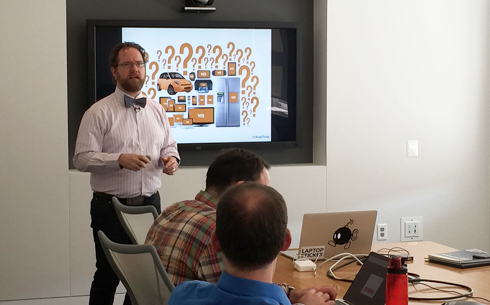
 Web standards and accessibility expert Aaron Gustafson was working with
a major drug store chain when he discovered they only tested their
website on iPhones and iPads.
Did they test their site on tablets, Gustafson asked. Specifically, did the chain know what their site looked like on the $50 tablet they sold in their own stores?
The store’s response was, “we sell tablets?”
That narrow understanding of the website’s look and feel is a common issue in contemporary design, and it was the subject of a presentation Gustafson gave at 18F.
Watch the entire presentation here.
Gustafson hails from the web standards world. He wrote the book “Adaptive Web Design” and worked for A List Apart before joining Microsoft. During his talk, he underscored the issues that arise if we consider sites only through the lens of expensive technology — the nicest objects with excellent processors.
“It gives us a myopic view of what the mobile web is like for people,” Gustafson said. “The reality is a lot more messy.”
He challenged designers to improve user experience across browsers and devices. That means thinking about more than 1,000 different screen resolutions and a plethora of devices. But it’s an important task, because designers who think first about upscale cellphones and computers are forgetting about the web experiences of most Americans.
For example, Pew research shows that smartphone users who make less than $30,000 a year encounter app errors 52 percent of the time. That means these users can download apps, but they often won’t open or don’t work.
Gustafson’s solution is progressive enhancement.
“It’s basically building the web, without putting any technical restrictions on it,” he explained.
Progressive enhancement doesn’t demand that users have modern, updated browsers. Its only assumption is that website visitors have access to the internet and some way to read text — either visually or with a screen reader.
Advanced functionality — like the stylings of CSS and the interactive features of Javascript — are built on top of that baseline, but they’re added to the site only when the browser can support it. That way, the page always works.
“Progressive enhancement offers the user a customized, a la carte experience,” Gustafson said. “A dynamic web page can never break, it can only become a web page.”
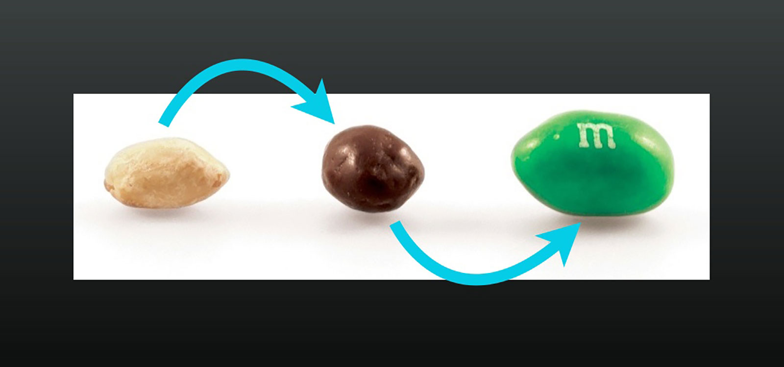
As an analogy, Gustafson compared progressive enhancement to a peanut M&M.
The text is the peanut, a fine snack on its own. But with chocolate (CSS), it’s tastier. And it’s best with colorful candy coating (Javascript). Ultimately, you can enjoy it at whatever step you get it.
 Slide from Gustafson’s
presentation.
Alongside his presentation (see the slides here), we also had the chance for a more in-depth chat with Aaron (via email) about design-related topics, including maintaining awareness of our gadget obsession and recommendations for building a pattern library. Read on for more from our conversation.
Note: This interview has been edited and condensed.
Kate Garklavs: What’s the number one obstacle folks encounter as they adapt their interfaces for mobile, and what actionable tips can you offer folks facing this challenge?
Aaron Gustafson: I think coming to terms with the fact that we can’t control everything is a struggle for many designers. The web is quite different from any other medium in that we have little to no control over how our content reaches our audiences. A number of factors affect the final product: the network, the browser, the device, screen size, amount of RAM, processor speed, assistive technology in use, and so on. When you begin to think of experience as a continuum rather than some monolithic ideal, you start to see these as constraints that help you focus on what matters rather than annoyances you have to work around.
Kate: You’ve mentioned that we (people working in tech) must remain aware of our fondness for the latest, greatest gadgets in order to design well for diverse audiences. How can people stress the importance of this outlook — and make sure it’s represented in workflows — in an organization that might not share this view?
Aaron: This is a real challenge for many organizations. It’s helpful to find real people (rather than avatars) to represent the different constituencies you’re trying to reach. Real people with real challenges are always more relatable and often foster more situational empathy. Beyond that, it’s sometimes helpful to overwhelm certain people with data regarding device proliferation and diversity. The Next Web’s recent report on Android fragmentation is a great example of this.
Kate: What recommendations would you give to someone building a pattern library for the first time?
Aaron: Start small. Look for simple, repeatable patterns and codify those first. Then add to the library bit by bit. In an ideal world, I like to have a large team working on the pattern library, with different team members responsible for a handful of patterns. If each pattern is “owned” by a small sub-team consisting of folks from different disciplines — content strategy, design, development — the end result is often better than if one person makes the patterns and other have to implement them. Ownership is important because it gets people invested in the library and ensures they’ll use it. And by having each small team focus on a handful of patterns, they can be on the constant lookout for ways to improve and iterate on them.
Kate: A more personal question: Do you apply principles of progressive enhancement to non-work aspects of your life?
Aaron: I think the most obvious way I apply progressive enhancement in my life is by trying to be as egalitarian as I can in the things I do. I think equality of opportunity is important, but so is the understanding that equality of outcome is not always possible or even desirable. It’s important to be adaptable and roll with the punches as it were. I’m a big fan of the saying, “We cannot control what happens in this world, we can only control our reaction to it.” Those are words I try to live by.
Kate: What sites, people or resources do you turn to for inspiration?
Aaron: I’m a big fan of Jeremy Keith’s work when it comes to big-picture web stuff. I also find Bruce Lawson, Christian Heilmann, and Tim Kadlec to be quite insightful. There’s really no beating Sara Soueidan when it comes to learning about SVG. I also love the presentations and writings of Stephen Hay, Zoe Mickley Gillenwater, and Lyza Danger Gardner.
Kate: Finally, what one piece of advice would you offer new designers?
Aaron: I can’t pick just one, so I’ll give you two: My first piece of advice is to take the time to really understand the web as a medium. It can take some time, but will make you a better designer. My second piece of advice is to be flexible, not only in the way you design but in how you think about your process and how you view the results of your work. These two pieces of advice will serve you well in the long run.
Thanks again to Aaron for sharing these insights with us. If you’re interested in learning more of the specifics of his techniques (including sample code), check a video of his presentation or his slide deck.

