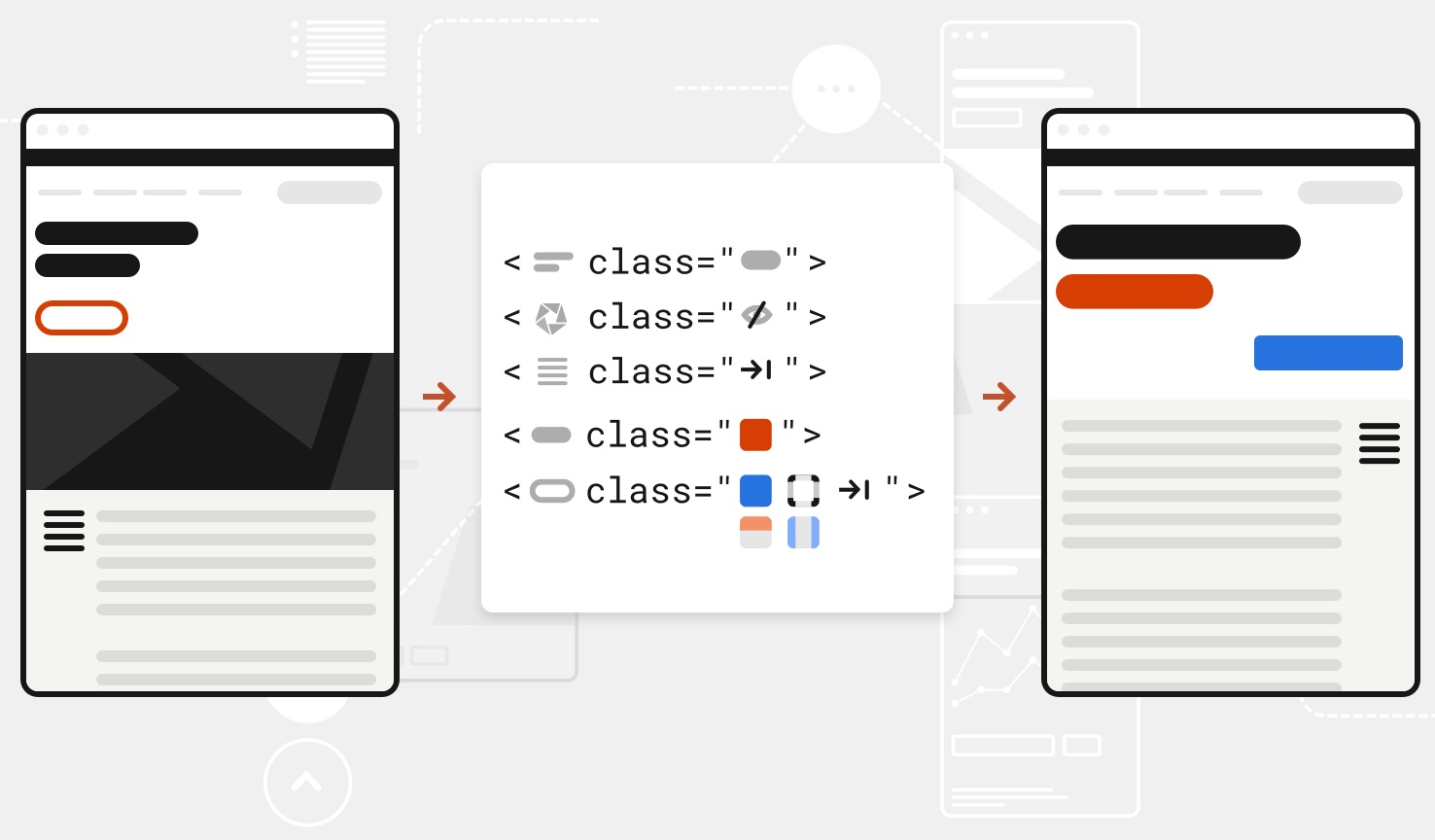
The U.S. Web Design System (USWDS) is a design system for the federal government that allows you to start from a customizable, thoroughly-tested, and responsive template with an extensive component library. It lets you be creative while still being accessible, consistent, and efficient. It’s also free, open source, and on GitHub or Drupal, so anyone can use it.
Designers at 18F ❤️USWDS. We use it as the starting point on almost every project.
But, as awesome as USWDS is, there are still many considerations on what makes a good design. Using a design system doesn’t guarantee a successful design or user experience, but it can be a helpful tool for solving a design problem.
What design systems do (and don’t do)
A design system is a toolkit to support design and development problem solving. It contains the building blocks of style, guidance, and code so that designers and developers can build a digital service.
We use USWDS at 18F because it helps us:
- Provide consistency to teams and to users. USWDS uses best practices to create guidelines and interaction patterns for common components, like form controls, buttons and accordions and design tokens for discrete style elements, like color, font sizing and spacing. Using USWDS makes it easy to deliver expected and consistent interactions to users. And, it also gives USWDS users a common language across agencies and projects so it’s easier to communicate with one another.
- Enforce key standards. USWDS components work across multiple devices and they’re 508 compliant. USWDS also provides tools like a graded color naming system so it’s easier to make accessible choices.
- Jumpstart projects. With an out-of-the-box set of components and a theme, it’s easy to get started fast. USWDS also provides developer packages and design files to cut down on start-up costs.
- Make decisions faster and more confidently. Designers make thousands of decisions over the course of a project. By having a set of tested components based on best practices, we can reduce the number of decisions we have to make and focus our energy on interactions and elements we know will need more attention.

But, a pattern library doesn’t answer all design decisions. In fact, teams make their first design decisions way before they get to patterns. They have to answer questions like:
- What problem are we solving?
- Where does the problem start?
- Who is affected by this problem?
- How are they affected?
- How many ways could we solve this problem?
- What are the risks involved?
- What other systems might this impact?
It can be tempting to jump right into building something new when patterns and code are easily accessible—but new technology and patterns won’t solve every problem outright. This is why USWDS guides new users to integrate user-centered design principles and follow UX and user research guidance before implementing any specific USWDS patterns.
Cathy Dutton explains this more in her article “The Problem with Patterns.”
USWDS and other design systems give flexibility so teams can build the right solution for users, but there are still plenty of design decisions that teams need to make to be successful.
What designers do
Designers help define users, problems, and potential solutions. At 18F, USWDS is often a key part of that solution, but we rely on a number of other tools and skills to create useful, usable, and meaningful designs.
Research and problem definition

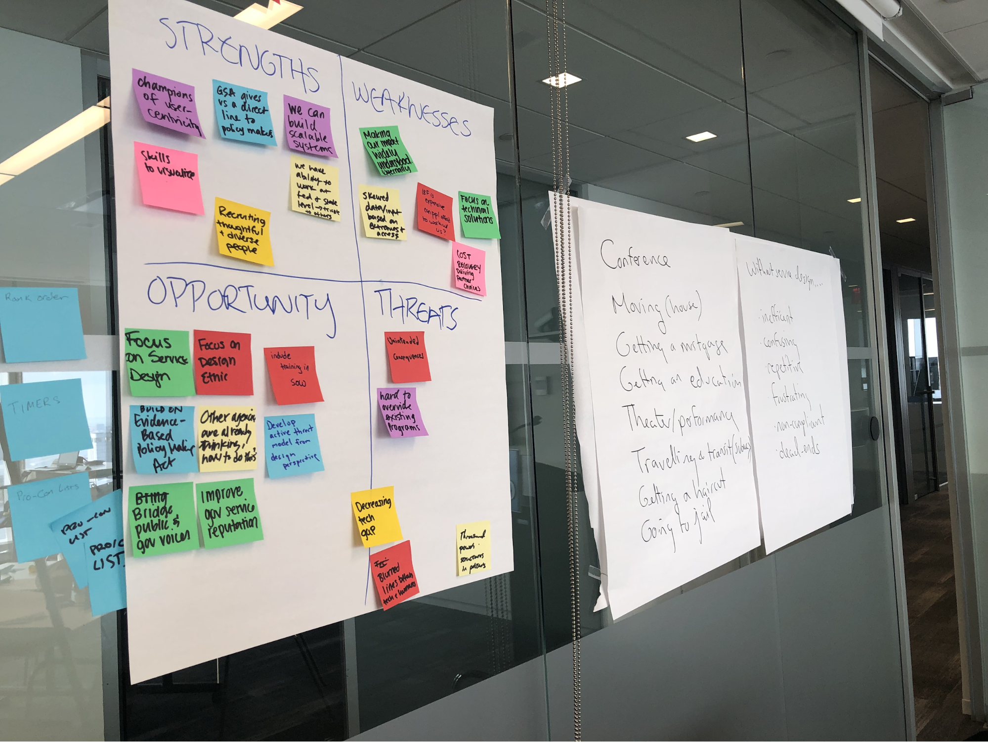
Using human-centered service design, we put humans first—learning their needs, and then trying to solve their problems with or without technology. Service design allows us to think about the whole ecosystem of a product or service. This helps us think about the effects, intended or not, on all people who would touch what we’re creating, making sure we’re thinking inclusively and responsibly about what we create.
Understanding the problem allows us to narrow the scope of a project, which is not only cost-effective but allows us to create and thoroughly test the right solution. USWDS lets us prototype potential solutions to put in front of users for their feedback, which is more efficient than building something no one’s going to use.
Build trust and recognition

Visual design is just one part in the wide world of design—it balances form and function, establishes identity, and employs principles that allow users to get information as effortlessly as possible. Visual design also considers people with different visual impairments.
The way something looks is how sighted people initially make judgments on people, places, and things. With digital products, users rely on visual cues to understand the site’s broader context. If a website doesn’t look “trustworthy,” users will proceed with caution. Appearance impacts users’ opinions and decisions, but it’s not the only factor. Good user interfaces should have a clean structure with clear hierarchy and a logical reading order, which helps everyone make sense of a website’s information and functionality.
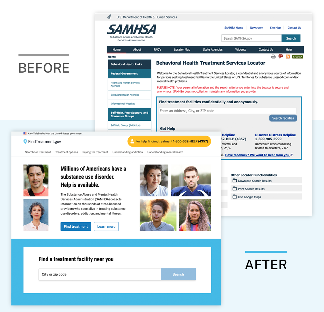
All government websites shouldn’t look exactly the same because trust and recognition are not universal. Instead, the design must match the tone and subject matter of each agency’s unique mission.
Visual designers at 18F start with USWDS to bring best practices and consistency to projects. We work with agencies, developers, and product managers to identify which parts of the design system to customize if any, to keep projects feasible and within budget. USWDS 2 has Sketch and Adobe XD design files that define common patterns, and built-in design tokens for discrete style elements. These tools give visual designers the flexibility to add unique layouts, fonts, colors, and images while still speaking the USWDS design language.
Design for people in a wide-variety of situations

Although many considerations for accessibility are baked into USWDS, 508 compliance is not enough. Accessibility.18f.gov has a lot of useful tools like the Pa11y Automated Tool and Accessible color matrix but technology is not a replacement for talking to people, understanding their pain points, and creating something that works for everyone.
Inclusive design includes the accessibility component of design but has a larger consideration of diversity in the people we serve. Sometimes people trying to access government services:
- Are deployed out of the country on slow Internet connections
- Work two jobs, care for an aging parent, and access online services on a public computer in a library
- Are new to the English language and only use the Internet on a mobile device, sometimes in transit on a city bus
- Have trouble hearing or seeing as they get older, and rely on family to help
These people could be in crisis, in a hurry, or in a life-threatening situation. So it’s imperative that we’re talking to a wide range of people and finding unique solutions to fit a wide range of experiences and abilities.
Write content that meets people’s needs

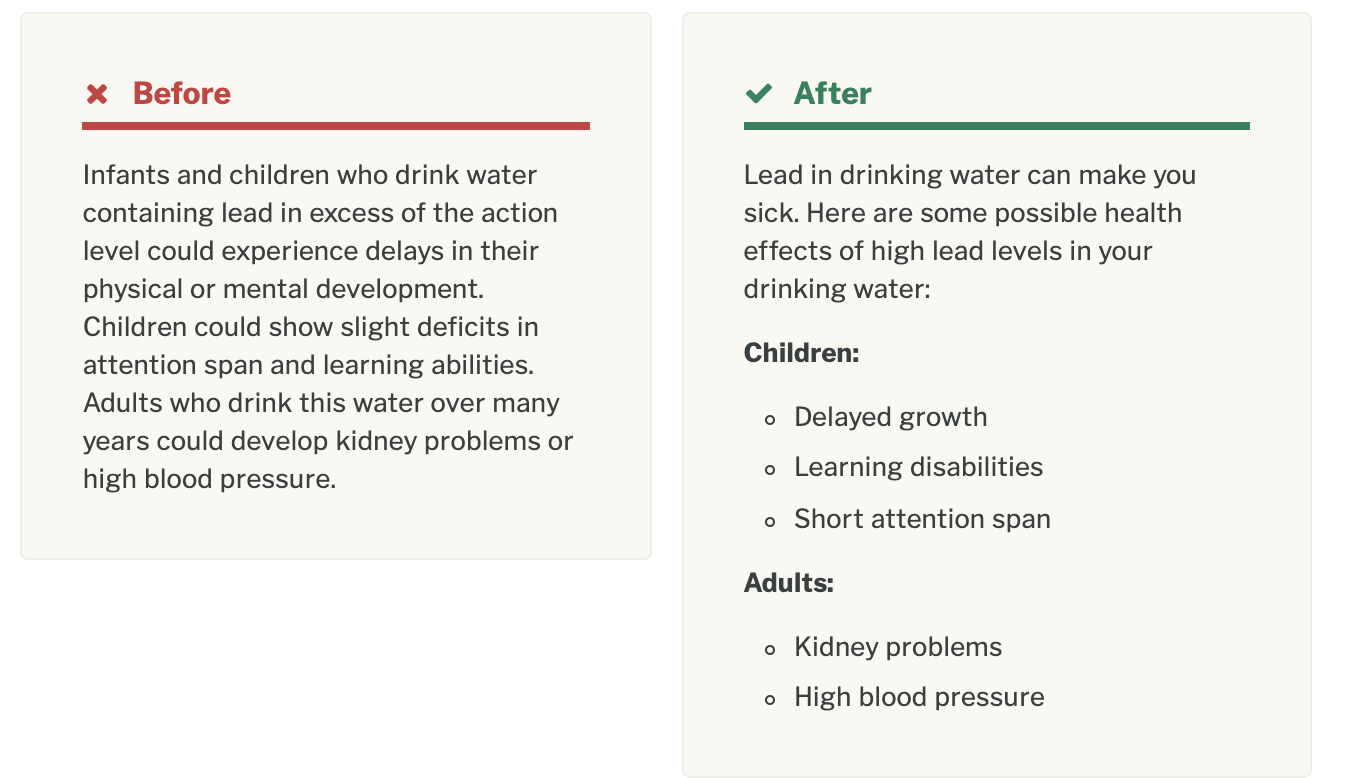
Easy-to-read language lowers a person’s cognitive load. That means people can find what they’re looking for faster, and with less stress. Content designers use plain language, or more-familiar words, and they’ll define words that aren’t familiar. It also takes into consideration what’s appropriate given the user’s situation.
Just as USWDS is a great starting point for front-end components, you can use 18F’s Content Guide as a starting point for content. Our content guide is open source, which means you can use it as is or as inspiration. Adding voice and tone guidance will ensure that all content creators are able to write in a way that reflects an agency’s unique brand voice. As a result, published materials will feel more consistent, and users will develop a stronger attachment to the brand.
–
18F teams can partner with agencies to coach and empower teams to use these best practices for user-centered design and content. We can also help agencies to determine brand goals, align teams on a shared design language, and assess if USWDS is right for them.
We create in the open so anyone can replicate our processes. Once you’ve identified that a web-based solution is best, USWDS and some of our open source design resources can help you meet your agency’s unique mission:
- Plainlanguage.gov: Best practices for writing content that users understand and reflect an agency’s brand to build and maintain trust.
- Accessibility.digital.gov: Guidelines to help teams create accessible products and services.
- Methods.18F.gov: Useful approaches and tools to bring human-centered design into any project. Feel free to create an issue on GitHub if you have a suggestion for any of these methods.
- 18F’s Content Style Guide: Guidance for building out your voice and tone.

