In developing a redesign for cloud.gov, our team found we had multiple sites with separate codebases, sometimes written in different programming languages with different frameworks that all had a shared visual style. When figuring out a technical solution to coding the visual style that was mocked up for us, we needed a solution that would scale to all these different sites without requiring us to copy code. Our solution to this problem is our “shared style library”, a library of CSS, JavaScript, images, and fonts that can be distributed to multiple codebases to create a shared visual style. Our style library includes a build process to package and optimize all the assets, versioning to ensure consumer sites receive the correct features of the style library, and a distribution method that allows multiple types of sites in different frameworks to consume the library. The library is called “cloudgov-style”, or “cg-style” and is available on GitHub and npm.
Design
The idea of cloudgov-style started with a redesign of cloud.gov itself, which included a styleguide, mockups for the main cloud.gov landing page, and the cloud.gov docs site. The visual style was designed using the Draft U.S. Web Design Standards as it was a good starting point to ensure the design incorporated the same values as other government sites. Plus, starting with existing code made creating our visual style much faster.
In the same vein, the cloudgov-style is built on top of the code of the Draft Standards. It does this by installing the web design standards from npm, resetting some Sass variables that are in the standards to override things like default colors and widths, then importing the standards Sass files.
// cg-style/src/css/main.scss
@import "./override_vars.scss";
@import "../../node_modules/uswds/src/stylesheets/all.scss";

@import "base.scss";
@import "components.scss";
The overridden variables have to be imported before the standards because the values have to be changed before Sass parses the Web Design Standards’ SCSS to ensure the colors are changed. There is a caveat: this method of overriding variables doesn’t work with the current version of the web design standards due to an implementation bug. To get around this, cloudgov-style is currently using a custom branch of the web design standards where this bug has been fixed:
// cg-style/package.json
"dependencies": {
  "uswds": "git+https://git@github.com/18F/web-design-standards.git#952-override_variables"
},
The overridden variables mostly modify the default colors in the standards so they match the cloud.gov file as defined in the mockups:
// cg-style/src/css/override_vars.scss
$color-primary:              #277CB2;
$color-primary-darker:       #2C3E50;
$color-primary-darkest:      #1F2C38;

$color-primary-alt:          #3498DB;
$color-primary-alt-dark:     darken($color-primary-alt, 40%);
$color-primary-alt-darkest:  darken($color-primary-alt, 70%);
$color-primary-alt-light:    #F3736E;
$color-primary-alt-lightest: lighten($color-primary-alt, 70%);
...
CSS architecture
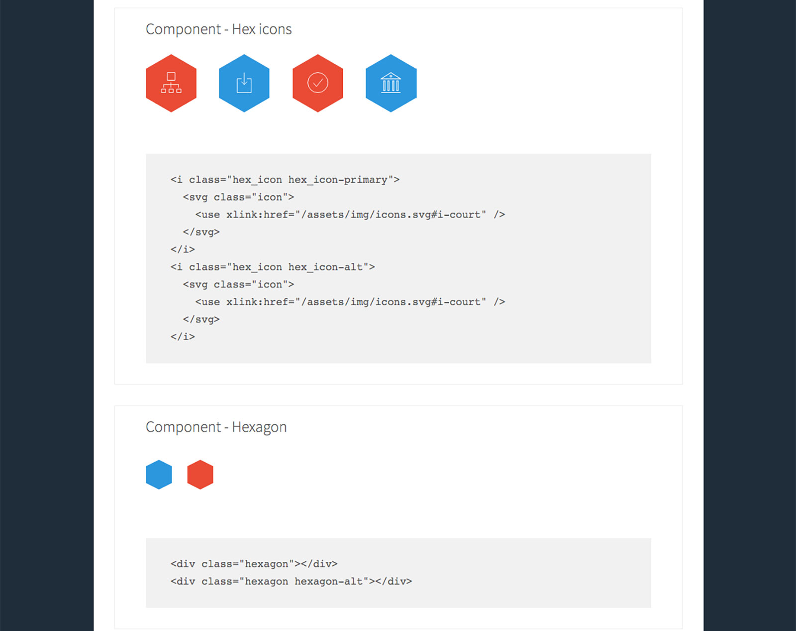
The cloudgov-style library uses a similar philosophy as the standards and suggestions pointed out in the Architecture section of the 18F CSS Coding Style guide. in that it starts with low specificity, base element rules and moves down through higher specificity components built with a BEM-like naming convention. The consumer sites, such as the landing page and the docs page, are built up from these separate components. As an example, cloudgov-style has a component for horizontal navigation, a hexagon component for the stylistic hexagon icons, and a logo component to ensure the logo has the correct size and layout for the large display text on the landing page. These components are separated into Sass files in a components directory and imported into one central components file.
- src/css
  - billboard.scss
  - footer.scss
  - header.scss
  - hexagon.scss
  - icon.scss
  - logo.scss
  - nav.scss
Before the components are imported there are base rules that are only applied to HTML elements (no classes or ids). Some of these override styles set by the standards, such as resetting some of the base fonts sizes to ensure em and rem units are in sync:
// cg-style/src/css/base/global.scss
html {
  font-size: 16px;
}

body {
  font-size: 16px;
}
Other base rules reset typography across the site to ensure it conforms to the cloud.gov style:
// cg-style/src/css/base/typography.scss
h3 {
  font-size: 1.5rem;
}

h4 {
  font-size: 1.1875rem;

  & + h4 {
    margin-top: .5rem;
  }
}

h5 {
  font-size: 1rem;
}

p {
  font-family: $font-serif;
  font-size: 1.05rem;
  line-height: 1.75;
  ...
Base rules combined with component classes allow different sites to incorporate the cloud.gov style into different site layouts with a matching visual style.
Images and fonts
Almost all images used in the cloud.gov style are best done with SVG, with a few raster images from the standards. The cloudgov-style build process first copies all the image and font assets from the standards into a distribution directory in cloudgov-style. It then takes any source SVG images from the cloud.gov style and uses a gulp plugin, gulp-svg-sprite, to compile a sprite of SVG <symbol>s. This sprite is output to the same image distribution directory as before. Compiling the SVGs into one sprite of symbol elements allows consumers of the cloudgov-style library to use SVG images with a <use> tag. This means developers don’t have to find, compress and paste the correct svg code to display an image, they can use links to image names that are linked from the style guide and are compressed by a build process.
<svg class="icon-primary">
  <use xlink:href="/assets/img/icons.svg#i-user_researched" />
</svg>
This allows for SVG images to have their colors or other styling changed from an external stylesheet, which means you can use a standard CSS class to apply different styling to them. Changing an SVG’s style from an external stylesheet would not be possible if this was done with an <img> tag or CSS background image. This technique was taken largely from Cloudfour’s case study on their SVG icon process. A future improvement here would be to ensure there’s a .png fallback for these SVG images.
Distribution
The source Javascript and CSS files are compiled by the cloudgov-style build process and placed in distribution css and js directories (which are git-ignored so only source files are in the cg-style repository). There are also minified versions of both files placed in their respective distribution directories. This allows consumers of cloudgov-style to use the library in multiple ways depending on what’s easiest:
- Copy the minified or un-minified JavaScript and CSS from the cloudgov-style directory to a static assets directory:
cp ./node_modules/cloudgov-style/css/cloudgov-style-min.css ./static/vendor/cloudgov-style/css cp ./node_modules/cloudgov-style/js/cloudgov-style-min.js ./static/vendor/cloudgov-style/js - Use a tool like browserify to require the source JavaScript file to be compiled by the consumer site
require('cloudgov-style'); - Import the src SCSS cloudgov-style file with Sass to be compiled by Sass by the consumer site
@import './node_modules/cloudgov-style/src/css/main.scss' // OR if includePaths set correctly for Sass @import 'cloudgov-style' - Copy all the fonts and images from the cloudgov-style directories
cp -R ./node_modules/cloudgov-style/img/**/* ./static/vendor/cloudgov-style/img cp ./node_modules/cloudgov-style/font/**/* ./static/vendor/cloudgov-style/font -
Include all the compiled assets with the jekyll ruby gem, cloudgov-style-gem
 // Gemfile
 group :jekyll_plugins do
    gem 'cloudgov-style'
  end
Having these different options allows different consumer sites with different build setups to use cloudgov-style in whatever way makes the most sense. Future improvements here would be to write the main JS file so a tool like webpack would be able to process all the assets by importing the main JS file. Another improvement would for there to be a way to change the image and font paths in the CSS/Sass files so everything would still work if the consumer site couldn’t have the same directory structure for CSS and images.
Style guide
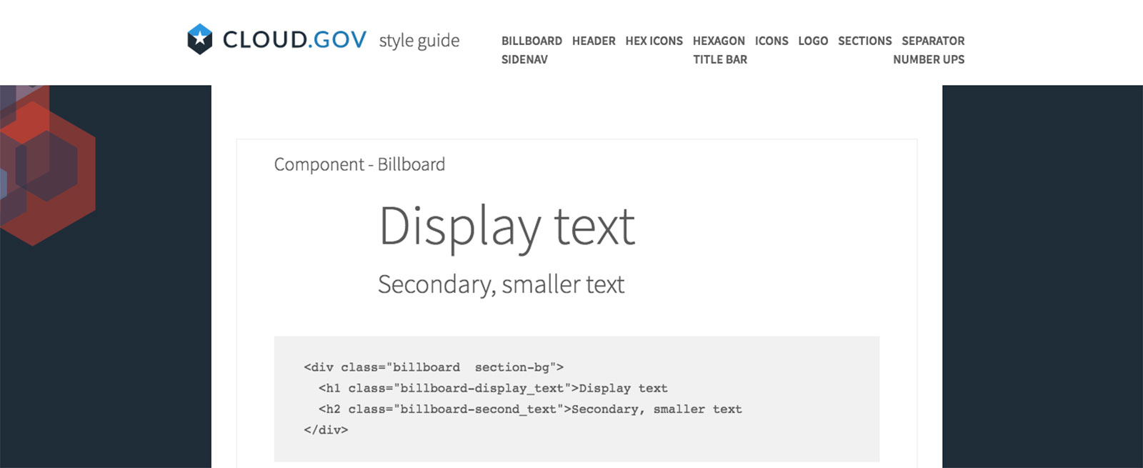
Another feature of cloudgov-style is a minimal, coded, style guide to allow for visual regression testing of new code and for developers to see what components are available and how to implement them. This style guide is created with a simple Jekyll site in the cloudgov-style repo. The style guide has each component displayed in an example use case along with a code sample to show implementation.
While all the components are displayed on the homepage, each component also has an individual page where it’s displayed in isolation. This is done to create a “clean” environment for visual regression testing. By placing each component on it’s own page, there won’t be any false negatives in visual regression testing when there are layout changes to the components. We decided to use a hand-coded style guide built on Jekyll rather than using a tool like KSS to make it easier to place each component on it’s own page.
Continuous integration
The cloudgov-library uses npm scripts as it’s main build process along with a gulp task for SVG spriting. It packages everything into separate directories for CSS, JavaScript, images, and fonts and publishes it on npm and RubyGems. The build process can run locally and with Travis CI. When a commit of the repository is git tagged, it will automatically deploy to npm and RubyGems from Travis. There’s also a build task that allows a developer working on cloudgov-style itself to see changes live on the internal styleguide or a consumer site that uses cloudgov-style through the use of npm link.
If you’re interested in learning more about cloudgov-style, head over to its git repository. You can also look at two site’s that are using the cloudgov-style in different ways: cloud.gov landing page and docs.cloud.gov.


