Our projects are iterative, which means we keep working on them after they launch. In keeping with that practice, we’ve kept a close eye on everykidinapark.gov, which went live September 1. We’re excited to share a few of our improvements and updates with you today.
Why fourth graders?
After the launch, we noticed a lot of discussion centered on why the program was created for fourth graders.
Program leaders chose fourth graders because research shows that kids ages nine to 11 are beginning to learn about the world around them — they’re open to new ideas, and they’re likely to connect to nature and our history. This year is just the start. Every year, a new group of children will become fourth graders and get the opportunity to visit parks for free.
You can read more on why the program is targeted at fourth graders on our new Parents and guardians page. Just like the rest of the site, we designed and wrote it to appeal to children.
Responsive, inclusive design
From its launch, the site worked on mobile devices, but we wanted to continue improving our design across multiple displays; 59 percent of our sessions have been on tablets and mobile devices. Visitors will now find an improved navigation menu on smaller screens.
Additionally, our team believed the site should be inclusive of America’s diverse public. We knew that information aimed at “parents” didn’t capture the broad array of families in the U.S. We went back into the site and changed the wording to read “parents and guardians.” It was a small change, but it made the site more friendly to more families.
“We are delighted that the site is so kid-friendly and user-focused,” said Julia Washburn, National Park Service associate director for interpretation, education, and volunteers. Washburn worked closely with us throughout the site’s development.
We also worked on the site’s accessibility for vision-impaired users. It’s largely keyboard accessible, includes detailed alt text for images, and has improved text-to-background contrast.
Finally, our last post discussed the importance of writing at a fourth-grade level. As we’ve added content, we’ve made sure to keep it a fourth-grade reading level. If you’d like to see how our pages break down, the reading level of page is on our Every Kid in a Park README.md file.
Less news is good news
Despite hefty website traffic, we’ve fielded relatively few questions from users. This is a testament to our team’s dedication to user experience, visual design, responsive development, and engineering.
“That users were able to successfully reach the paper pass creation stage helped underline the importance of keeping things simple and intuitive,” said Chris Goranson, the Presidential Innovation Fellow assigned to this project.
18F Developer and Product Manager Shashank Khandelwal was heartened by the response.
“I’ve heard a few people say that it’s a good looking site. In the space we live in, if they’re not complaining, then we did a good job.”
18F Front End Developer Christine Cheung agreed.
“There isn’t much critique, which is pretty good. Because everyone has an opinion.”
Final touches
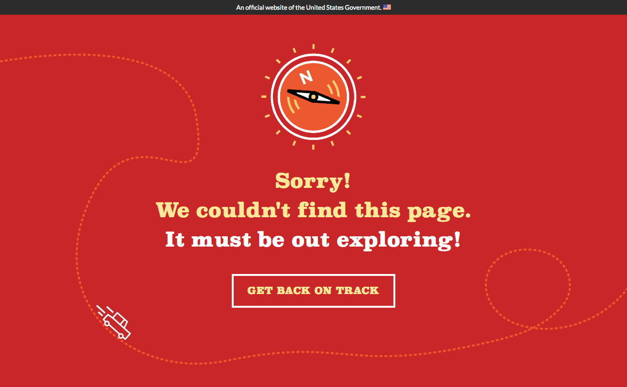
Although we hope our users never encounter it, we also added a 404 page. We’re proud of the content and design:

In all, we’re thrilled with everykidinapark.gov. We’ve handed the reins to the U.S. Department of Interior, but feel free to file a GitHub issue if you have suggestions — we’re always listening!

