Last month, I went to the Museum of Modern Art in New York City for the first time. I was there to see a special exhibit featuring the pop singer Bjӧrk, who is currently presenting a retrospective of her life’s work as a musician, artist and technologist. The retrospective spans back from her early beginnings as a childhood folk singer in Iceland all the way through to her most current album release.
Being a huge fan of Bjӧrk’s work, and having a fine art background myself, I equate this experience to visiting an ancient historical site, relic or monument.
After entering the exhibit, I was instructed to put on a set of headphones and listen to a poetic narration, which guided me through each exhibit room. Each room represented a different Bjӧrk album. The rooms were dimly lit, with artifacts and relics from each album throughout her career. These points in time gave me the space to stop, reflect and take in the music, art and technology that surrounded me.
It was awesome.
At this point, you may be thinking, “Why is someone writing about Bjӧrk on the 18F website?” Let me explain: As I was walking through the exhibit, I saw similarities between the way Bjӧrk has approached her career as both an artist and a technologist, and the way we think about the projects we are working on at 18F. What role does art play in our work? And what is our role as technologists?
Our work at 18F is informed by both our users and the experiences they have with the websites and applications we work on. As designers and developers, we help merge the user experiences by using art and technology to create useful, engaging, and delightful user-centered design. Artists help people see and experience the world around them in new or different ways. Similarly, our roles are to help government, and the American public, see, experience, and build technology in a different way.

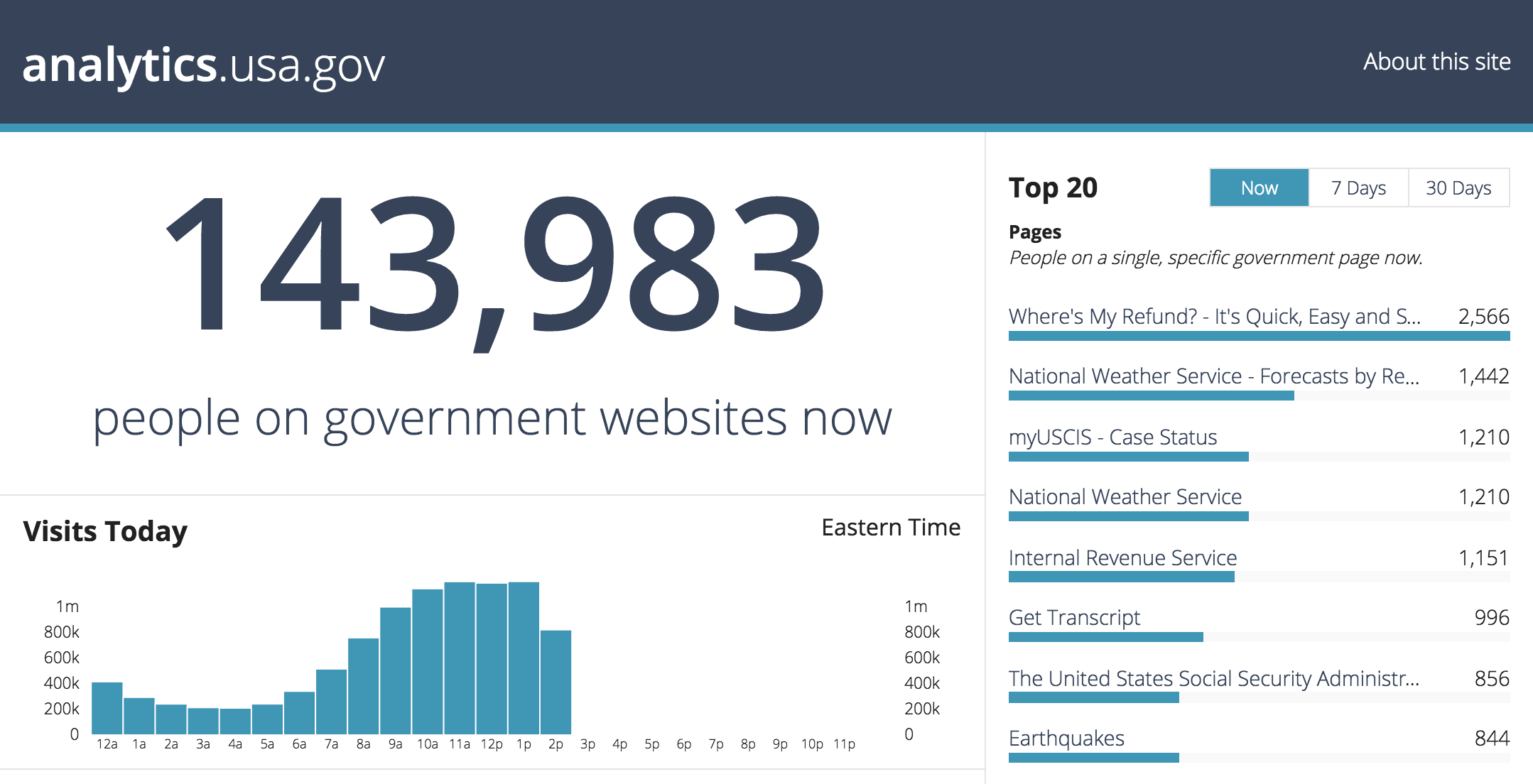
One way to help people process technology differently is by designing visualizations that allow people to quickly comprehend large amounts of data. Recently, 18F helped launch analytics.gsa.gov to display the web traffic from various federal government websites. The analytics site serves as a way for the public and government officials to easily see which federal government sites people visit the most. This viewpoint displays highly valuable and relevant information that aids in making impactful and long-term content decisions that affect the public. It also helps federal employees make targeted decisions on how to approach and then decide how to make user interactions more friendly on mobile.
In our workflow process at 18F, we frequently use sketching and rapid prototyping in the preliminary stages. We do this in part because they help people quickly understand the impact of user-centered design, agile sprints, and building prototypes. Our colleagues Alan deLevie and Robert L. Read, PhD. recently shared details on how to begin a project by sketching with code with a method called protosketching. By protosketching we can quickly work to create a prototype, or even a Minimum Viable Product (MVP), that is in sync with a project’s objectives and user needs. By using this type of sketching, agencies are able to “realize its mission more effectively and to save taxpayer money.”
Like Bjӧrk, we use both art and technology to shape how the team at 18F approaches the work we do inside of government. Our two-year appointments allow us to achieve short-term goals creating better user experiences for people who use federal websites and services. Our long-term goals are to change the way government agencies create and design digital services. As artists and technologists, we can achieve this by creating tools and services that not only do this, but also help change our long-term point of view.
Jeremy Canfield and Melody Kramer contributed to this post.

